Popup menu has become an essential part of mobile apps UI, in this article, I will guide you through the process of building popup menu components that you can use in both Android and IOS.
There is a lot of packages that you can use, but if you are facing a limitation(UI/positioning/animation/ etc..) or just want to improve your react-native skills this article is for you.
I’ll cover the most important parts of building a popup menu:
- How to let the menu popup appear on top of the screen
- Create the menu and MenuItem component to make it reusable
- Calculate the meu popup positioning.
Step1: two different approaches to display a popup menu
The Popup menu should display on top of the element that triggered the menu in other words on top of the screen, so to avoid the inherited styles from the parent and the zIndex issue there are two different approaches to solve this CSS issue.
- Modal: This approach is straightforward, pressing the trigger(by the trigger I mean the button that is responsible for opening the menu popup) will open a react native modal with the menu inside it, the modal will have a transparent background and you can easily control where to display the menu.
But we have one downside, opening the modal while the keyboard is up will lead to closing the keyboard on both Platforms, which is not ideal. - React Portal: Portals will solve this CSS issue by breaking the menu component from its parent and rendering it at the root level of the app.
we’ll use this react-native-portal package to achieve that.
In our case we’ll use the React portals inside our root component like this:
function App() {
  return (
    <NavigationContainer>
      <PortalProvider>
      {/* view wrapper to fix the menu display in android */}
      <View style={{flex: 1}}>
        {/* our menu portal Host */}
        <PortalHost name="menu" />
        <Stack.Navigator>
          <Stack.Screen name="Home" component={HomeScreen} />
        </Stack.Navigator>
      </View>
      </PortalProvider>
    </NavigationContainer>
  );
}
Step 2: Create the components and the props
- Menu component that will hold the trigger and be responsible for calculating the popup position.
- MenuItem component will include pop-up options and actions.
If you’re confused just hold on, the picture will be more clear as we jump to the code
import React, { useState, useEffect, useRef } from "react";
import {
  View,
  Pressable,
  StyleSheet,
  Platform,
  TouchableOpacity,
  Text,
  Dimensions,
} from "react-native";
import { Portal } from "@gorhom/portal";

const { width: layoutWidth, height: layoutHeight } = Dimensions.get("window");

const Menu = ({ trigger, children }) => {
  const [modalVisible, setModalVisible] = useState(false);
  const triggerWrapperRef = useRef(null);
  const itemsWrapperRef = useRef(null);

  const styles = StyleSheet.create({
    modalWrapper: {
      ...StyleSheet.absoluteFillObject,
      zIndex: 10,
      backgroundColor: "red",
    },
    activeSection: {
      backgroundColor: "white",
      alignSelf: "flex-start",
      zIndex: 99,
    }
  });

  const closeModal = () => {
    setModalVisible(false);
  };

  return (
    <>
      <Pressable
        onPress={() => {
          setModalVisible(true);
        }}
        ref={triggerWrapperRef}
      >
        {trigger}
      </Pressable>
      {modalVisible && (
        <Portal hostName="menu">
          <TouchableOpacity
            activeOpacity={1}
            onPress={closeModal}
            style={styles.modalWrapper}
          >
            <View
              ref={itemsWrapperRef}
              style={styles.activeSection}
              // for android as the ref may not return the item position
              collapsable={false}
              >
            {/* pass the closeModal to children prop  */}
            {Array.isArray(children)
              ? children.map((childrenItem, index) => {
                  return React.cloneElement(childrenItem, {
                    key: index,
                    closeModal,
                  });
                })
              : React.cloneElement(children, {
                  closeModal,
                })}
            </View>
          </TouchableOpacity>
        </Portal>
      )}
    </>
  );
};

export const MenuItem = ({ text, onPress, closeModal }) => {
  const styles = StyleSheet.create({
    body: {
      padding: 10,
    },
  });

  const handleOnPress = () => {
    onPress();
    closeModal();
  };

  return (
    <>
      <Pressable onPress={handleOnPress} style={styles.body}>
        <Text numberOfLines={1}>{text}</Text>
      </Pressable>
    </>
  );
};

export default Menu;
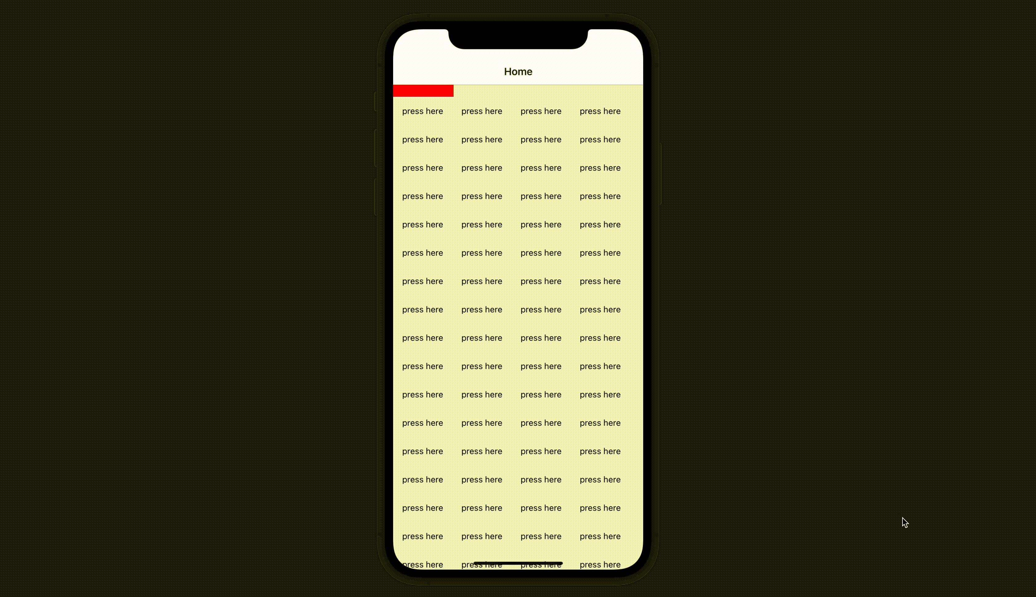
As we are just initializing the components, the menu will display a red background color on the entire screen, while displaying the MenuItem at the top(we’ll position the items later).
Now let’s use our components:
<Menu trigger={<Text>press here</Text>}>
  <MenuItem
    text={"Title"}
    onPress={() => alert("option pressed")}
  />
  <MenuItem
    text={"Recently Added"}
    onPress={() => alert("option pressed")}
  />
  <MenuItem
    text={"Recently Played"}
    onPress={() => alert("option pressed")}
  />
  <MenuItem
    text={"Playlist type"}
    onPress={() => alert("option pressed")}
    lastItem
  />
</Menu>
Now we have the main functionalities,
1 - The user clicks on the trigger
2- Menu pop-up appears on top
3- After the user clicks on the screen or the item the menu will be closed.
check how it looks https://youtu.be/gMs1bfngo4w
Step3: measure the position of the menu
For calculating the menu position we’ll need:
- Layout dimensions
- Menu dimensions
- Trigger dimensions
- Keyboard Height
Not like the layout and the keyboard, the menu and trigger dimensions are dynamic that’s why we’ll be using the Refs to measure their dimensions, so let’s do that first.
// states to hold the trigger and menu dimensions
const [triggerDimension, setTriggerDimension] = useState({
    top: 0,
    left: 0,
    width: 0,
    height: 0,
  });

const [modalDimensions, setModalDimensions] = useState({
    width: 0,
    height: 0,
  });


const calculateDimensions = () => {
    triggerWrapperRef?.current?.measureInWindow((x, y, width, height) => {
      setTriggerDimensions({
        top: Math.max(y, 0),
        left: x,
        width,
        height,
      });
    });

    setTimeout(() => {
      itemsWrapperRef?.current?.measureInWindow((x, y, width, height) => {
        setModalDimensions({ width, height });
      });
    }, 200);
  };

  // run the calculateDimensions each time the menu is visible
  useEffect(() => {
    if (menuVisible) {
      if (triggerWrapperRef?.current) calculateDimensions();
    }
  }, [menuVisible]);
We had already attached the refs when initializing the menu component.
In the above, I used `measureInWindow` in order to get the view position in the window, you can read more about it here.
For the keyboard height, we’ll add a custom hook to calculate it
import { useState, useEffect } from "react";
import { Keyboard, Platform } from "react-native";

const isIOS = Platform.OS === "ios";
const useKeyboardHeight = () => {
  const [keyboardHeight, setKeyboardHeight] = useState(0);

  const handleKeyboardDidShow = (e) => {
    setKeyboardHeight(e.endCoordinates.height);
  };
  const handleKeyboardDidHide = () => {
    setKeyboardHeight(0);
  };

  useEffect(() => {
    // keyboardWillShow is not supported on android
    const showEvent = isIOS ? "keyboardWillShow" : "keyboardDidShow";
    const hideEvent = isIOS ? "keyboardWillHide" : "keyboardDidHide";
    const showSubscription = Keyboard.addListener(showEvent, handleKeyboardDidShow);
    const hideSubscription = Keyboard.addListener(hideEvent, handleKeyboardDidHide);
    return () => {
      showSubscription.remove()
      hideSubscription.remove()
    };
  }, []);

  return { keyboardHeight };
};

export default useKeyboardHeight;
then we can use it in our menu component like this
const {keyboardHeight} = useKeyboardHeight()
Just hold on we are almost there, now we will just add the calculation to position our menu.
const { top, left } = useMemo(() => {
    let left = 0;
    let top = 0;

    left =
      triggerDimensions.left - modalDimensions.width + triggerDimensions.width;
    // if the popup is outside the screen from the left
    if (triggerDimensions.left - modalDimensions.width < 0)
      left = triggerDimensions.left;

    if (isIOS) {
      const initialTriggerTop =
        triggerDimensions.top + triggerDimensions.height + 10;
      if (
        modalDimensions.height + initialTriggerTop >
        layoutHeight - keyboardHeight
      )
        top = triggerDimensions.top - modalDimensions.height - 10;
      else top = initialTriggerTop;
    } else {
      const initialTriggerTop =
        triggerDimensions.top +
        triggerDimensions.height +
        StatusBar.currentHeight;

      top =
        initialTriggerTop + modalDimensions.height >
        layoutHeight - keyboardHeight
          ? initialTriggerTop -
            triggerDimensions.height -
            modalDimensions.height
          : initialTriggerTop;
    }

    return { top, left };
  }, [modalDimensions, triggerDimensions, keyboardHeight]);

const menuPositionStyles = { left, top };

return (
  <View
    style={[styles.activeSection, menuPositionStyles]}
    collapsable={false}
    ref={itemsWrapperRef}
  >
    {/* children */}
  </View>
 )
Hereafter doing the calculation inside React.useMemo (no need to go through the details) the menuPositionStyles will holds the top and left that the menu should display.
We then pass the menuPositionStyles to the View that wraps the menuItems childrens.
There is one more important trick that we need to add, now the menu will jump on the screen and that’s because the calculation takes a bit of time to complete. To fix that we need to add this in the activeSection style
opacity: modalDimensions.width !== 0 && triggerDimensions.left !== 0 ? 1 : 0,
This way the menu will be hidden until the calculation finishes and the jump will disappear.
Thanks for reading 📚
I hope this article helps you build your custom menu popup.
Check the code on Github.